
One of the simplest and most revealing ways to understand housing affordability is to compare home prices to household income.
Venture Consulting 1-8-26
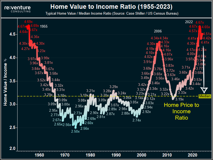
The chart above tracks the ratio of typical US home values to median household income going back to the 1950s. While the housing market has gone through many cycles over the decades, this ratio has historically stayed within a surprisingly narrow range.
For most of modern US history, homes have cost about three times annual household income.
That long-term stability makes the last two decades especially notable.
The Long-Term Baseline: Around 3x Income
From the 1950s through the early 2000s, the home price to income ratio generally hovered near 3.0x. There were ups and downs during recessions, inflationary periods, and expansion cycles, but the market repeatedly reverted back toward that level.
This matters because income ultimately determines what buyers can afford. When home prices drift too far away from wages, affordability tightens and demand eventually adjusts.
That relationship held steady for nearly half a century.
The 2006 Housing Bubble: A Clear Break from History
The first major departure from the historical pattern occurred during the mid-2000s housing bubble.
By 2006, the ratio climbed to approximately 4.3x income, well above the long-term norm. That surge was driven by a combination of loose lending standards, speculative buying, and mortgage products that allowed buyers to stretch far beyond traditional affordability limits.
The outcome is well known. When prices corrected, the ratio fell back toward historical levels as values declined and incomes gradually caught up.
This period reinforced a key reality of housing markets: when prices disconnect from income for too long, corrections tend to follow.
The Post-2020 Surge: Higher Than the Last Bubble
What makes the current cycle especially striking is that it exceeded the 2006 peak.
By 2022, the home price to income ratio reached roughly 4.7x, the highest level on record. This time, the causes were different:
- Historically low interest rates
- A sharp increase in housing demand during the pandemic
- Severe inventory shortages
- Broad asset inflation across the economy
Unlike 2006, lending standards were much tighter. However, affordability still deteriorated rapidly because incomes simply did not rise fast enough to keep pace with home prices.
Recent Cooling: Adjustment, Not Normalization
Over the past year, the ratio has declined modestly, falling from about 4.7x to roughly 4.5x.
This shift reflects higher mortgage rates slowing demand, modest price corrections in some markets, and continued wage growth. However, the ratio remains far above its historical baseline.
In other words, the market has adjusted, but it has not reset.
Affordability today is still significantly more strained than it was for most of the past 70 years.
What This Ratio Tells Us About the Road Ahead
This chart does not predict short-term price movements, but it does frame the long-term forces at work.
There are only a few ways the ratio can move back toward historical norms:
- Home prices decline
- Incomes rise meaningfully
- A long period of stagnant prices while wages catch up
- Some combination of all three
Each outcome has different implications for buyers, sellers, and the broader economy, and the path forward may vary by region.
What remains clear is that housing affordability is still under pressure, even after recent cooling.
Why This Matters for Buyers and Sellers
For buyers, this ratio helps explain why homes still feel expensive, even when prices stop rising. The issue is not just price levels, but price relative to income.
For sellers, it highlights why demand has become more sensitive. When affordability stretches far beyond historical norms, buyers become more selective and price-conscious.
For everyone, it is a reminder that housing markets are ultimately anchored to what people earn.
Final Thought
The most important feature of this chart is not the peaks or the pullbacks. It is the long, steady line near 3x income that dominated for decades.
History suggests that housing markets can bend for a time, but they rarely detach from income permanently.
Whether today’s market normalizes through price declines, income growth, or simply time remains to be seen. But the data makes one thing clear: affordability has not yet returned to normal.
And that makes this moment worth paying attention to.